The goal of Stockshimi is to create an intuitive and efficient ingredients inventory app targeted for busy restaurant workers.
This will allow restaurant workers to focus more on customer service, improving the overall efficiency and satisfaction of the business.
Upgrading Online Inventory Tracking
Have you ever encountered a situation where a restaurant has denied your order because they ran out of ingredients? Or maybe you’re a restaurant worker trying to find a way to tackle this issue?
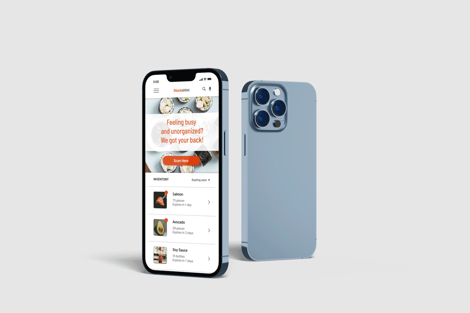
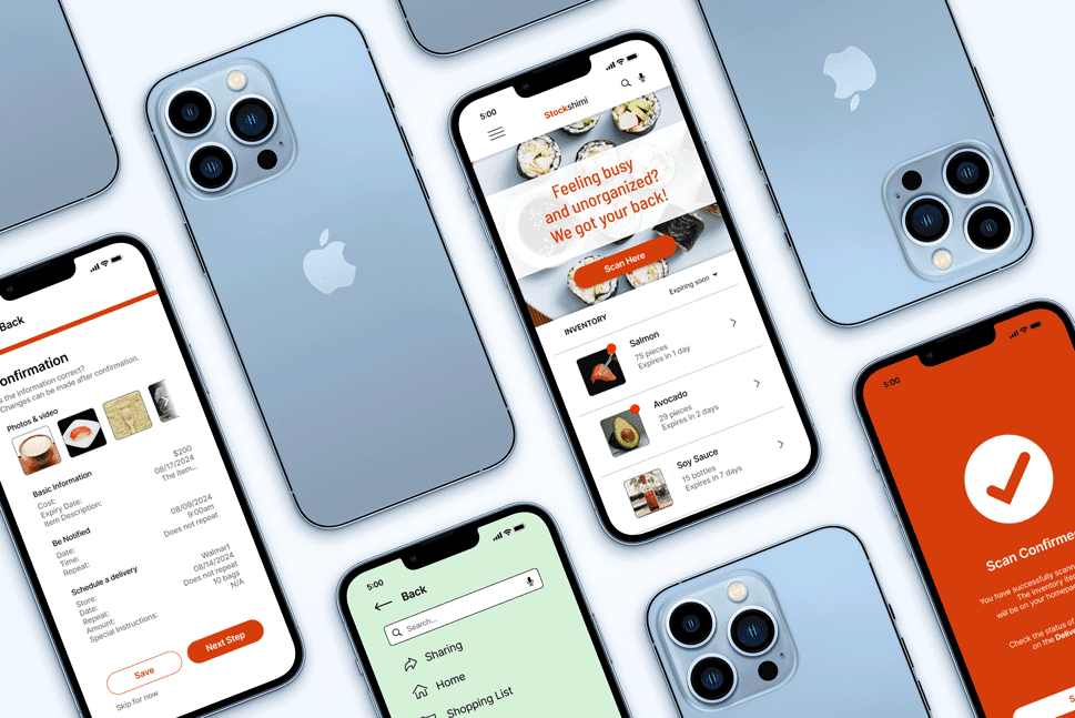
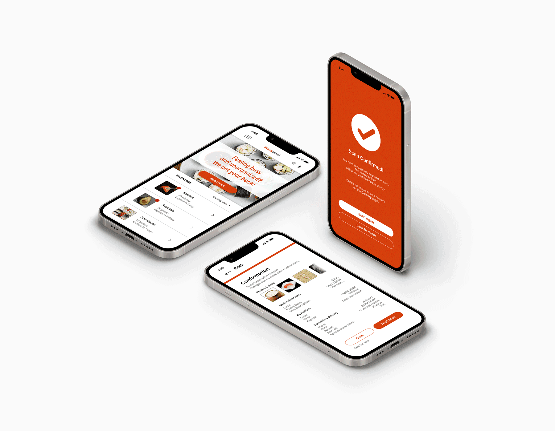
Stockshimi is an ingredients inventory app for sushi restaurants, dedicated to scanning, organizing, and alerting busy restaurant workers about their inventory. They can focus more on the customer’s orders worry-free.
Over the course of five months, I had the opportunity to complete the Google UX Design Professional Certificate, where I cover topics such as UX research fundamentals, inclusive design, wireframing, the different fidelities of prototyping, and collaborative tools such as Figma and FigJam.
Overview
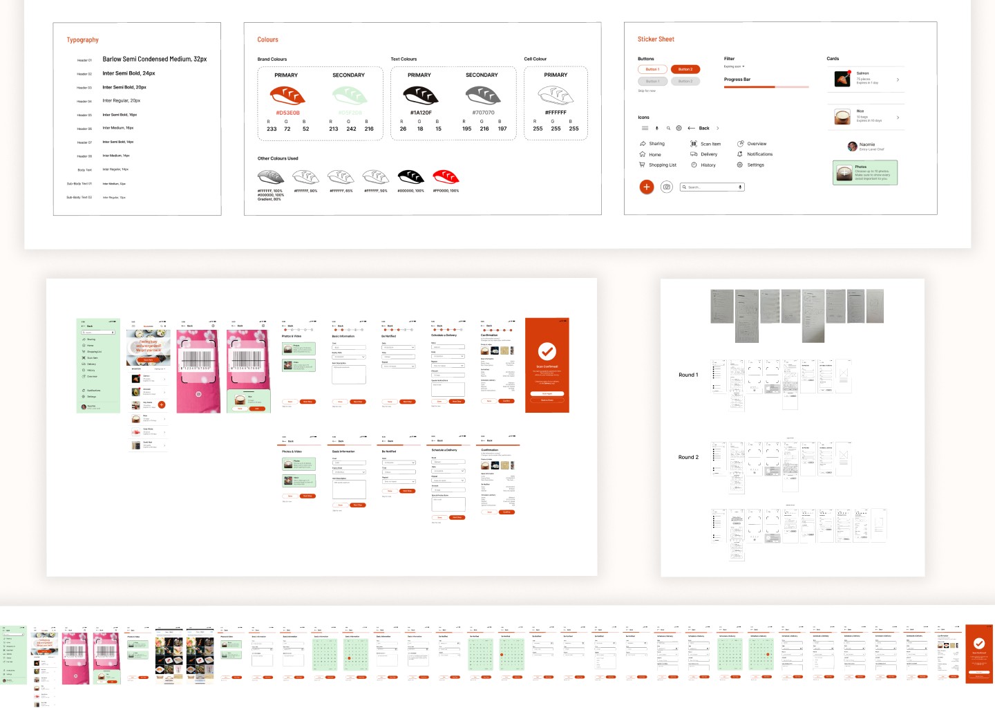
As the sole designer for this project, I took on all aspects of the design process. I started with user research, using surveys, interviews, and usability tests to understand user needs, challenges, and preferences. I then analyzed and synthesized this data to create user personas and identify key user goals. From there, I developed user flows and wireframes to define the app's structure and functionality. The next step involved designing the visual identity, focusing on an intuitive, user-friendly interface that aligned with the brand.
Project Brief
In a world where food waste and poor inventory management are ongoing challenges, Stockshimi seeks to address these issues by offering a simple, intuitive solution to track, manage, and optimize ingredient use. This app is designed to streamline inventory processes, reduce waste, and help users make smarter purchasing decisions.
Design Process
As a solo designer, I have actively sought critique and feedback from external designers, developers, and users of various abilities.
By pursuing an iterative process, I'm left with a greater understanding of how the product can be refined to meet user needs. With accessibility concerns and the project brief in mind, I decided to design a mobile app that enables restaurant workers and users alike to better organize their inventory, quickly and efficiently scan items, and alerting users for any necessary reminders.
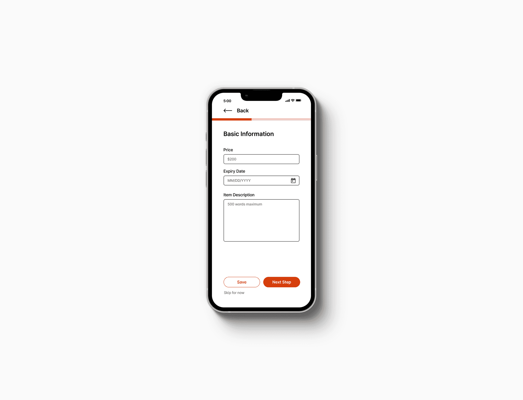
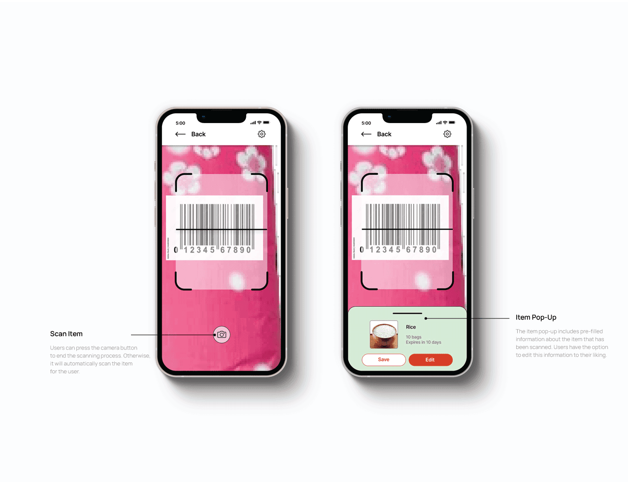
Design: Scan Item
Scanning items for inventory tracking enhances accuracy and efficiency. It reduces human error by automating data entry, speeds up stocktaking, and enables bulk scanning for faster processing. Scanning also ensures better traceability, making it easier to track items and monitor stock.
Users were asked to perform tasks in a low-fidelity prototype in the comfort of their own home. Upholding an unmoderated usability study gives participants the flexibility to follow through the task flow without any external pressure.
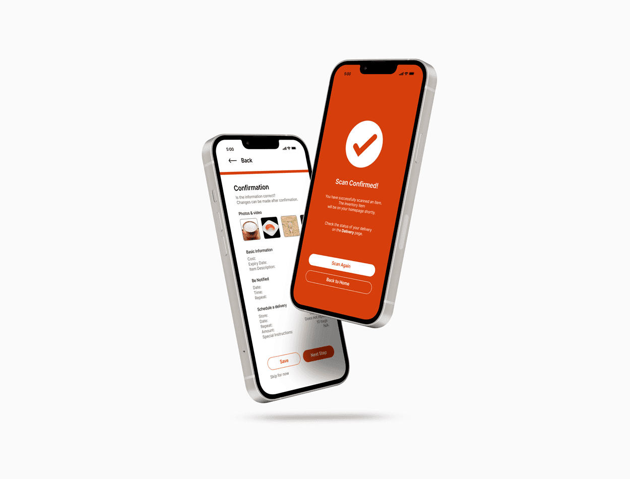
Initially, 3 of the 5 participants experienced difficulty finding the scanner because it was placed on the bottom navigation bar. Placing the scan button front and center allows users to quickly find the button and scan items during busy work days. Overall, moving the "scan item" button placement streamlines inventory management.
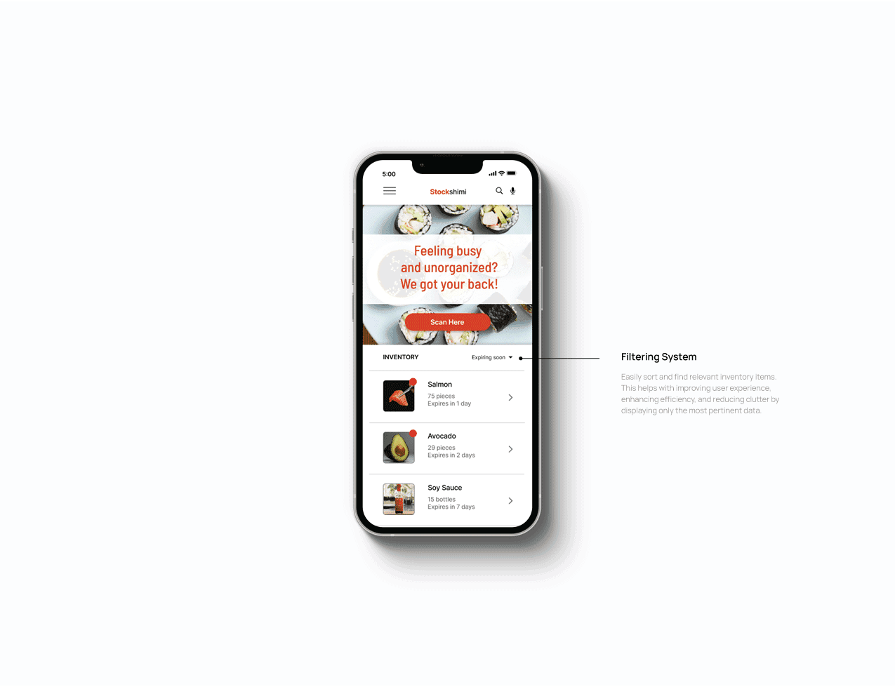
Design: Inventory Organization
Giving the users the freedom to quickly edit their inventory items according to their liking is effective for clear stock organization. The low-fidelity prototype sparks a crucial pain point that it's not immediately clear where and how to organize inventory items according to most participants in the unmoderated usability study.
To turn this pain point into a happy path, I have added a filter feature that users can edit freely on their own terms for easier organization.
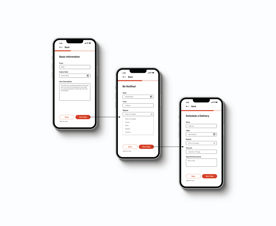
Design: Alerts & Notifications
A number of participants in the usability study reported that it's easy to forget minor tasks such as tracking ingredients due to the high-stress environment and the overwhelming amount of responsibilities restaurant workers need to fulfill. Alerts and notifications are essential for keeping users informed, engaged, and focused. Users can edit their own alerts, which enhances usability, improves user satisfaction, and drives desired behaviors, leading to better overall app performance and user retention.
Outcome
By automating tedious inventory tasks and providing real-time insights, the app will help reduce operational errors, prevent ingredient shortages, and improve kitchen productivity, allowing restaurant workers to concentrate on delivering high-quality customer service.
What I Learned
User Research
The primary research goal of this project is to determine if scanning an inventory item is easy or difficult and to identify how users add alerts when tracking their inventory. By utilizing an unmoderated usability study, I was able to further understand user needs through KPIs like time on task and system usability scale.
Next Steps
The project was completed promptly thanks to the guidance of the materials provided for the Google UX Design Professional Certificate. If I were to continue this project and make any changes, these would be my next steps:
Design the branding, ensuring consistency and responsiveness across multiple devices.
Expand the user flow for more organization options.
Improve in motion design and animations for smooth transitions between pages.